Aaron M. Wright

302-70 Dyrgas Gate
Canmore, Alberta
T1W 3J6

aaron@aaronwright.ca+1-647-746-9426Résumé PDF

Project
01
Company or product
1 of 2

I’m a product designer and frontend engineer with a particular fondness for fixing things people have learned to work around. Sometimes that means rethinking a complicated interface. Sometimes it means building a shared component or a tool that saves everyone a few hours.

I started building for the web in 1999, after discovering Microsoft FrontPage on the family computer. Within days, I’d published a homepage with all the requisite GIFs and marquees. Before long, I was building tools to do homework and trading websites for computer parts. I’m still motivated by that same satisfaction: making something useful, then watching someone use it.

At FreshBooks and Loopio, that curiosity grew into work on substantial product redesigns and the systems supporting them. At Loopio, I moved from designing and prototyping a new experience to building and documenting the React components other teams needed to extend it. I like being able to follow an idea through those different kinds of work.

Teaching has become another favourite part of what I do. I taught interaction design in the York/Sheridan and Sheridan design programs, and I’ve mentored designers and engineers throughout my career. I enjoy helping someone work through a difficult problem and come away better equipped for the next one.

These days, I’m especially interested in how better tools and practices can give teams more room to think. That includes finding useful applications for AI, alongside the scripts, plugins, and shared systems I’ve always enjoyed building. I care about raising the bar while making good work easier to do.
Situations I know well

  • A successful product has outgrown the interface and frontend it started with.
  • A redesign needs to improve familiar workflows without leaving existing customers behind.
  • Different teams keep solving the same interface problems in different ways.
  • Engineers are adopting unfamiliar tools while still being expected to deliver.
  • Repetitive work has become so routine that people have stopped questioning it.

What I’m like to work with

  • I like making ideas tangible early, through sketches, prototypes, or working code.
  • I’m comfortable moving between design critique and implementation details.
  • I enjoy teaching through real problems and working examples.
  • I notice everyday friction and tend to build something about it.
  • I get a lot of satisfaction from making someone else’s work easier.

Where I’m most useful

  • Making complex product workflows clearer and easier to navigate.
  • Turning a promising design direction into a working prototype people can evaluate.
  • Building design systems with the components, documentation, and examples teams need to use them.
  • Helping designers and engineers develop their judgment through critique and mentoring.
  • Improving how a team works through practical tooling, automation, and AI.
Project
02
Company or product
1 of 4
Role
Principal Designer → Sr. UX Engineer
Dates
2018–2022

A blank canvas re-imagining of Loopio's core offering

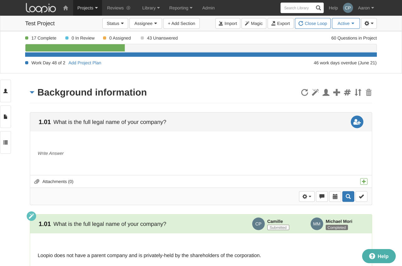
Loopio's core RFP workflow had outgrown the frontend beneath it. I partnered with Thomas Cheng to turn a redesign proposal into a working product, then carried that momentum into a tested, documented design system other teams could leverage and safely extend themselves.

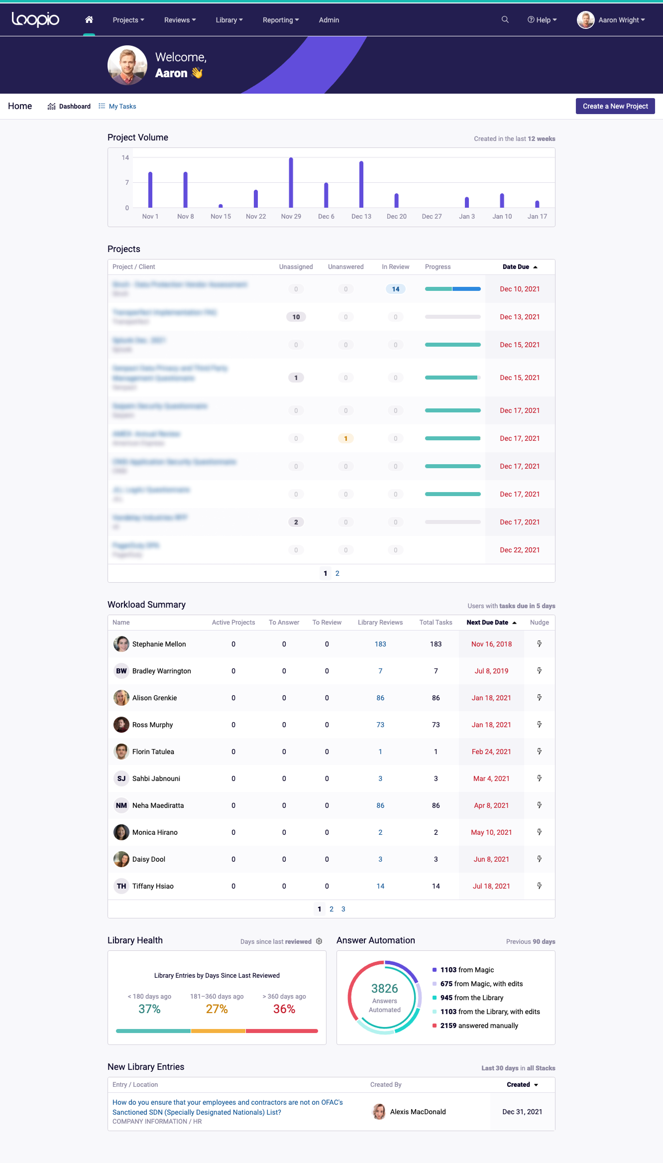
Loopio project workspace in the current product

The problem: the original prototype had overstayed its welcome

Loopio had found product-market fit, but its interface had accumulated several generations of frontend tech: jQuery, Backbone, React, Redux, Bootstrap, and one-off controls living side by side.

That inconsistency was expensive: designers and developers had to specialize in arbitrary "zones" and couldn't easily collaborate across those zones without onboarding. It was also hard to achieve consensus without a real “source of truth”.

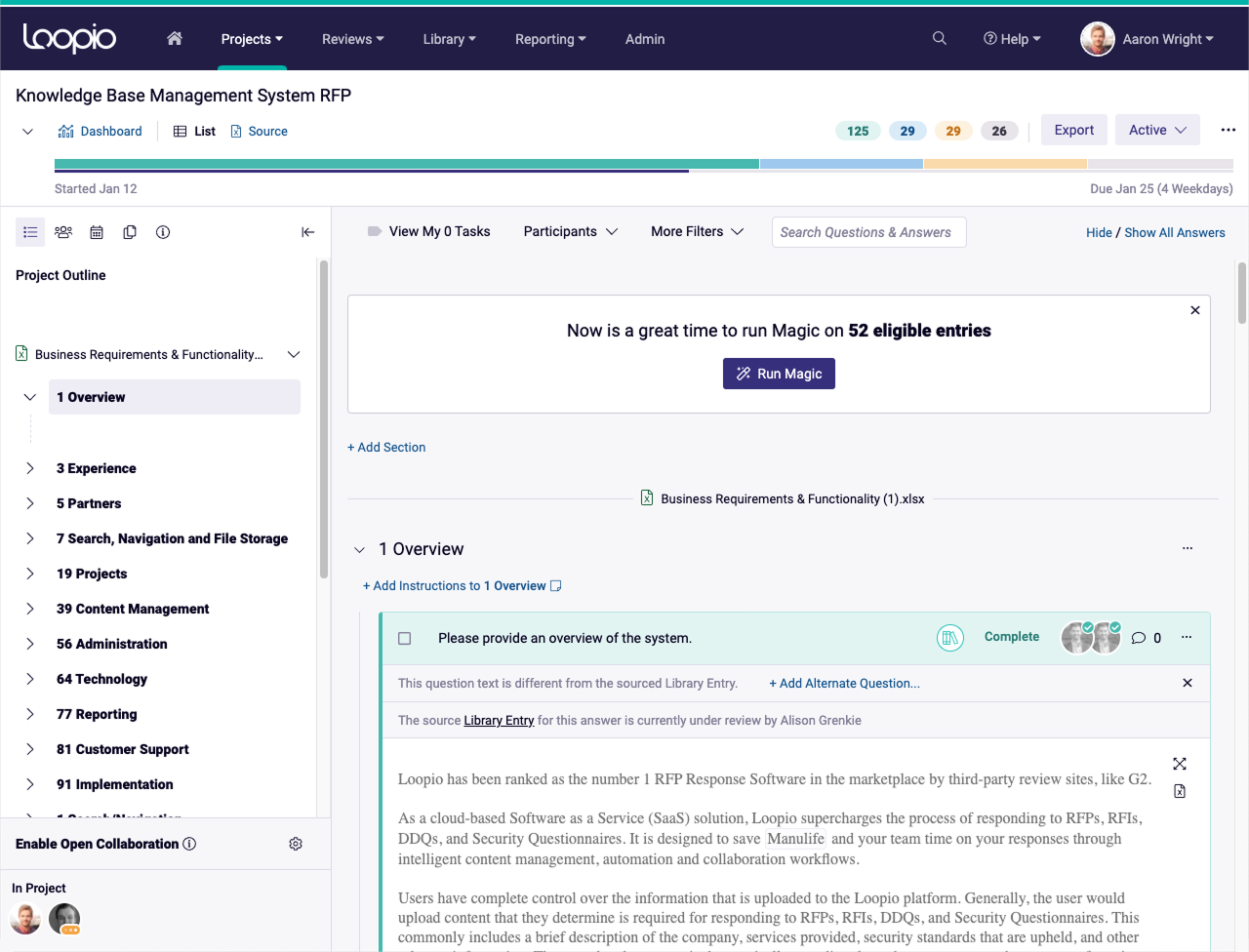
Loopio project workspace before the redesign

The solution: a prototype demonstrating Loopio’s potential

Thomas joined in August 2018 and felt the pain of working on the aging platform. Together, we ideated, prototyped, and iterated on a number of improvements to one of the platform’s core surfaces: the Project Workspace.

Decidedly the most complex UX in the product, we used it as a proving ground for how a purpose-built design system could make better use of precious screen real-estate, giving users more “questions per screen” while simultaneously surfacing features many users didn’t even know existed.

Loopio project redesign with bulk assignment controls

Principal hat: off. Developer hat: on.

The prototype received unanimous support from customers and our Sales team, which kicked everyone into high gear to convert the rest of the platform. A new problem surfaced: our team of engineers hadn’t yet mastered React or TypeScript and so couldn’t just immediately get working.

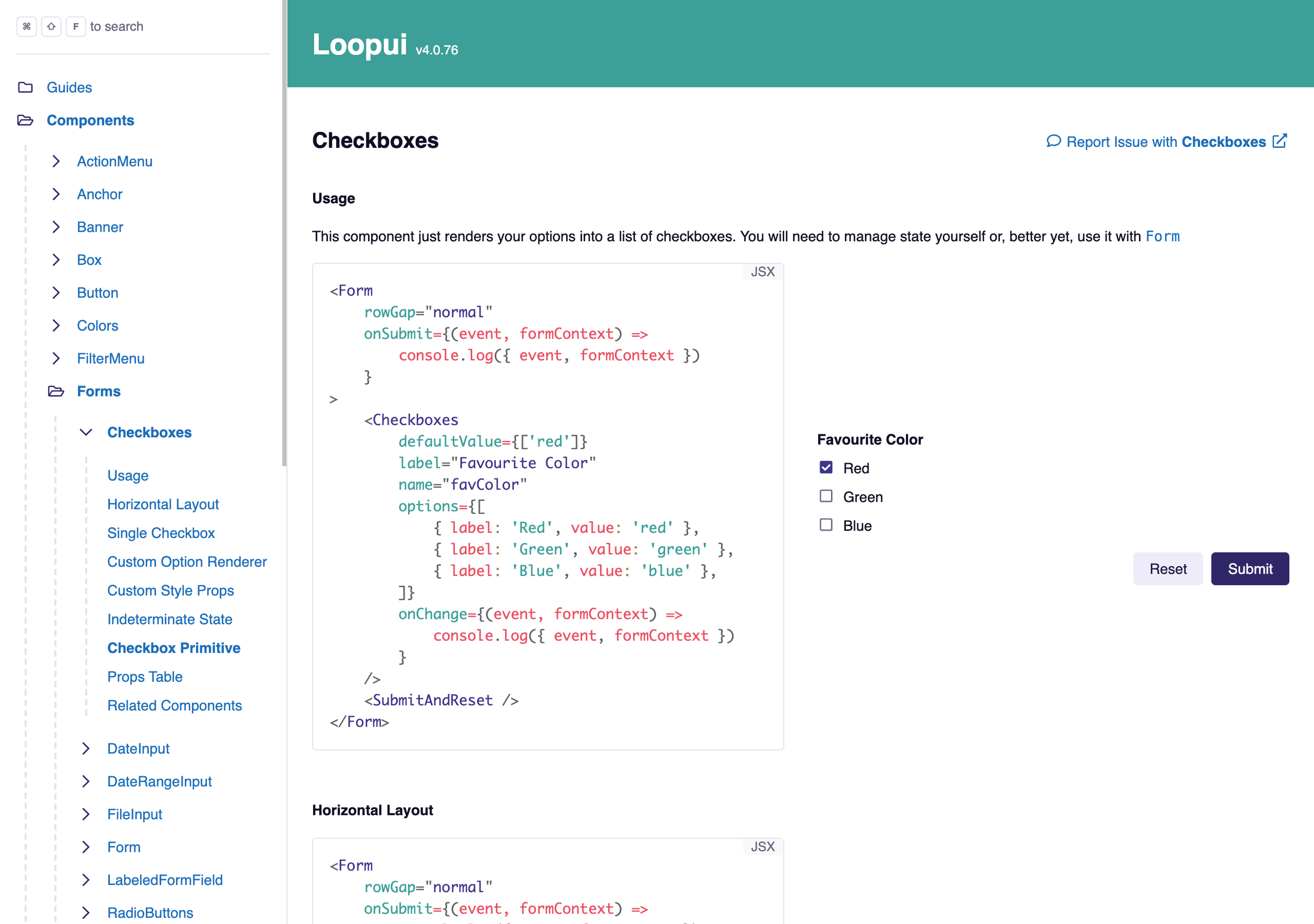
This is where I pivoted roles from leading the design of the system, to building, refining, and documenting the most commonly used and hard-to-build components so engineers had examples with live code snippets and supporting info like where and when to use which.

“Loopui” survives to this day, though by a new name, and on Storybook. My documentation platform is still live!

Recovered LoopUI Storybook documenting the Anchor component
Project
03
Company or product
1 of 4
Role
UX Designer
Dates
2012–2018

Redesigning for Simplicity and Scale

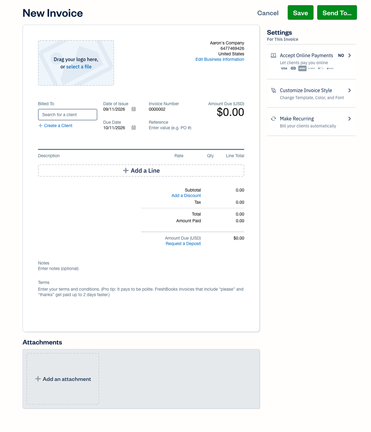
I was selected to join a small group of FreshBookers tasked with reimagining the platform as a coherent system: clearer workflows, reusable interaction patterns, and a bidirectional transition path that let customers move to the new platform when they were ready and even move back if they later decided they weren't.

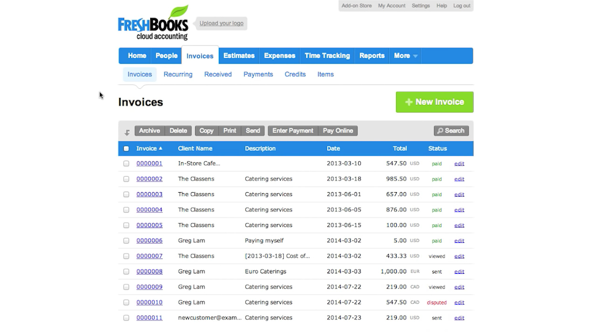
The current FreshBooks invoice editor

The Problem: A collection of disparate tools is not a platform

The FreshBooks application had aged but was still very much loved by our customers. Users weren’t suddenly experiencing major pains, but we — the teams building the product for more and more robust accounting — kept running into challenges extending systems that weren’t actually there.

Furthermore, the web had matured in a big way with “Web 2.0” showing users that web apps can feel like apps and not websites, but ours was more “website” than “app” with every click requiring a full reload and context reset.

An early FreshBooks redesign exploration organized around clients

The solution: a platform of tools that share context and work together

I helped design and systematize the new FreshBooks, contributing ideas that became app-wide patterns that boosted engagement and helped users make sense of each tool’s role in their small business accounting.

The WYSIWYG entity-creation screens, for example, turned long and complex forms into simple, recognizable documents that simply required users to “fill in the blanks”.

I also contributed the “Meta Pane”: each entity had its own set of tools and related settings which, in the old world, cluttered the UI. The Meta Pane rolled that functionality into neat little self-summarizing drawers of functionality on the right side of every entity. Users were also able to more clearly see valuable features and functionality they might have missed in the old app.

An early FreshBooks redesign exploration combining client activity

Long-term support

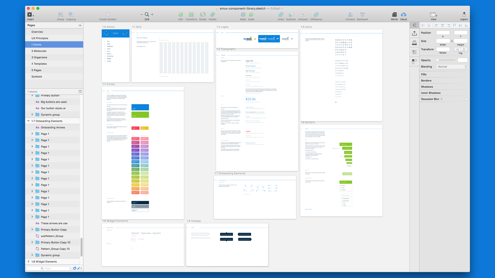
With a design system in place, I set to work on building supporting materials to help the other designers easily build new screens “like LEGO”, using patterns and tokens encoded into the components themselves (I was using Sketch at the time).

I also led the writing and building of documentation so developers and designers had access to real, working examples of our components, from “atoms” to “organisms”, complete with guidance on when to use each and where to find good examples of them in the living product.

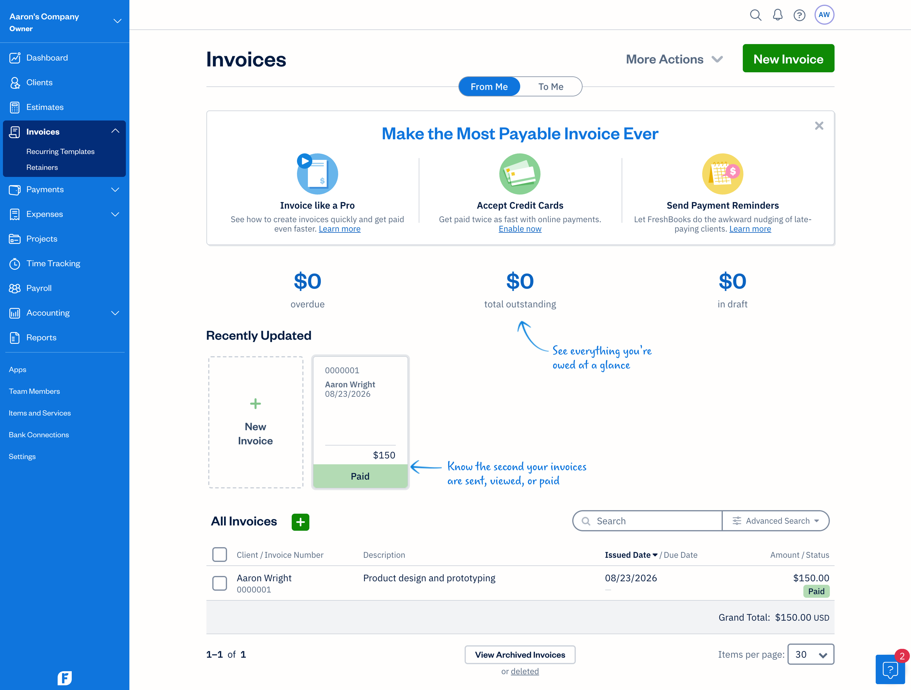
Current FreshBooks project creation flow using shared form and settings patterns
Project
04
Company or product
1 of 3

Content ownership without design drift

The website I'd built was a simple Next.js app and lived as code on GitHub and as a hosted app on Netlify. Making a copy change was just another task for me, but a bit of a steep hill to climb for someone just looking to fix a typo on a blog post. Time to hire a CMS.

I chose Contentful for its headlessness and built a lightweight editing workflow around it. The trick was giving teams the freedom to update their own content without giving them enough freedom to accidentally, shall we say, redesign the site.

1 of 3: Homepage Overview

One content shape for every editable surface

The staging version of the site pulls its content from Contentful, but includes content marked as draft whereas production only shows published content. In Contentful, everything takes the shape of a single, consistent object that I dubbed spot_copy_entry:

  • path: A required, unique, human-readable ID for this chunk of content.
  • body: Optional Rich Text content which arrives as bare HTML.
  • media: An optional picker for attaching one or more images.
  • json: An optional escape hatch for simple arrays, objects, or references to other spot_copy_entry paths.
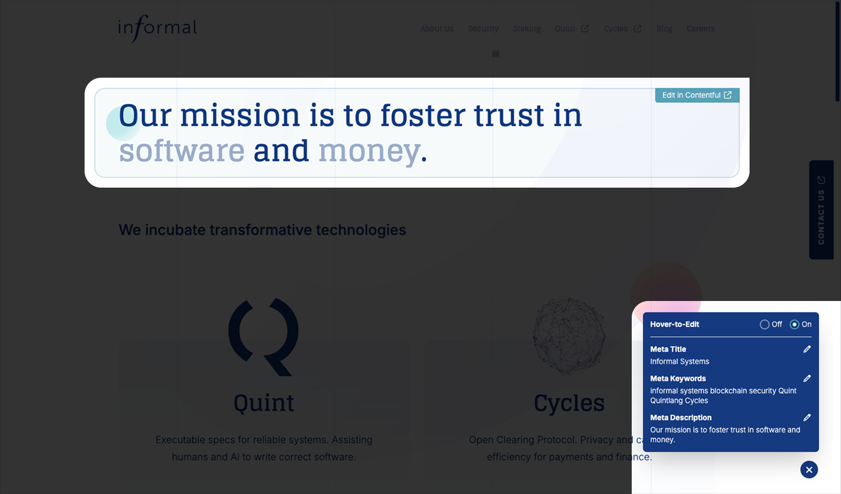
2 of 3: Hover-to-Edit

Let writers own the content while design stays in code

The websites that consume Contentful content make a single request, constructed at request time around the route's needs. It fetches the copy and image paths for the request and makes them available to the page through React Context.

I built a ContentfulSpotCopy component that accepts a path and a render prop receiving the fields for that chunk of copy. From there, I can build a carousel from the images, style the body however I want, or shape a completely different interface. The writers own the content while I own the design 👌

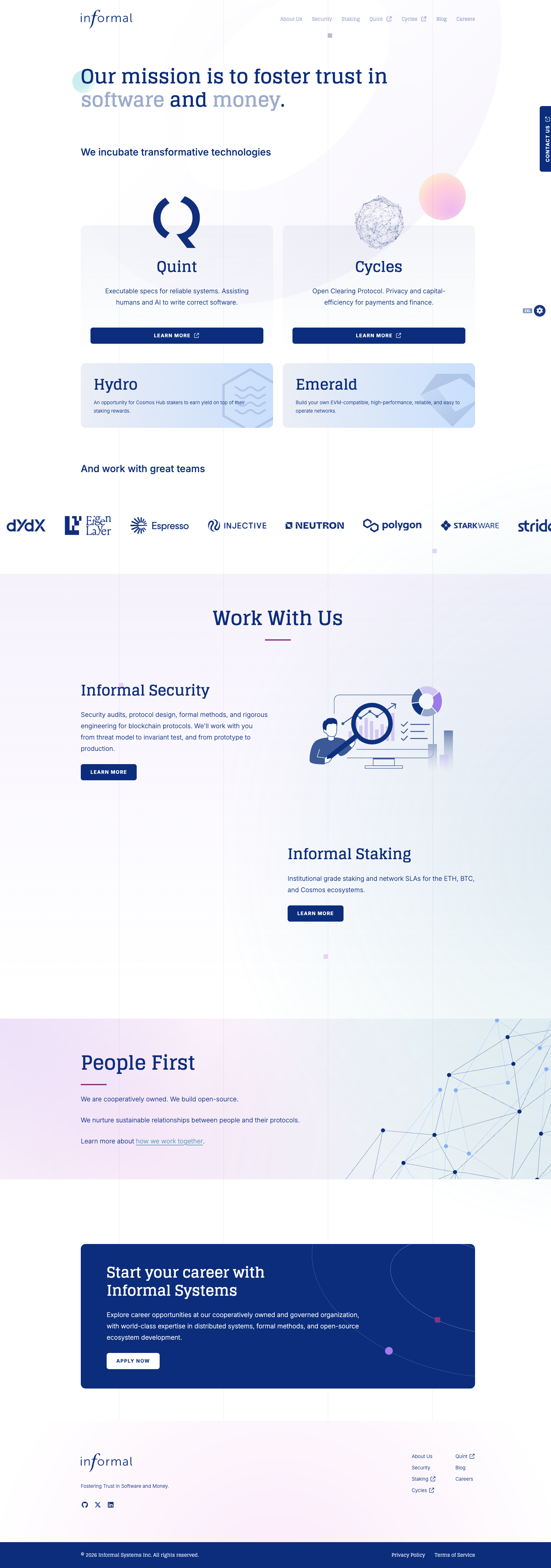
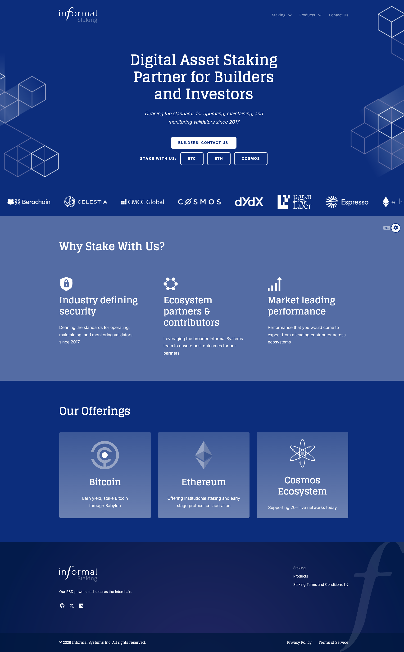
3 of 3: Informal Staking
Project
05
Company or product
1 of 6
Visit

I'm infatuated with Figma both as a user and as a developer building on their platform. I'm equally obsessed with the art and science of tool-building, so the match is cosmically perfect.

Aaron's Toolbox is a collection of utilities I've built to solve problems I repeatedly encounter in my own design work. Some automate repetitive tasks, others simplify common workflows, and two are actually evolutions of plugins I'd already built and refined over years of use (both with tens of thousands of users in the Figma Community).

My first Figma plugins were simple replacements for features I'd missed from other apps: Selection Saver revived a feature I'd long missed from Adobe Illustrator. Property Randomizer exists because I was assigned a dashboard project and wanted my charts and data to look real enough that they wouldn't be distracting. I once needed to do a fancy regular expression replace operation in a giant Figma file but it wasn't supported at the time, so I built Find and Replace and it's still among my most popular plugins.

There are few things from which I derive more satisfaction than my Figma plugins. They were useful to me, sure, but knowing that so many others have been spared the same tedium I'd faced myself is just 👩‍🍳🤌 I think they're the best expression of what I'm all about.

Small tools for repeated friction

Some Toolbox utilities automate repetitive tasks; others simplify workflows that are technically possible but needlessly tedious. Each began with a problem I encountered often enough that solving it once was worth turning into a tool.

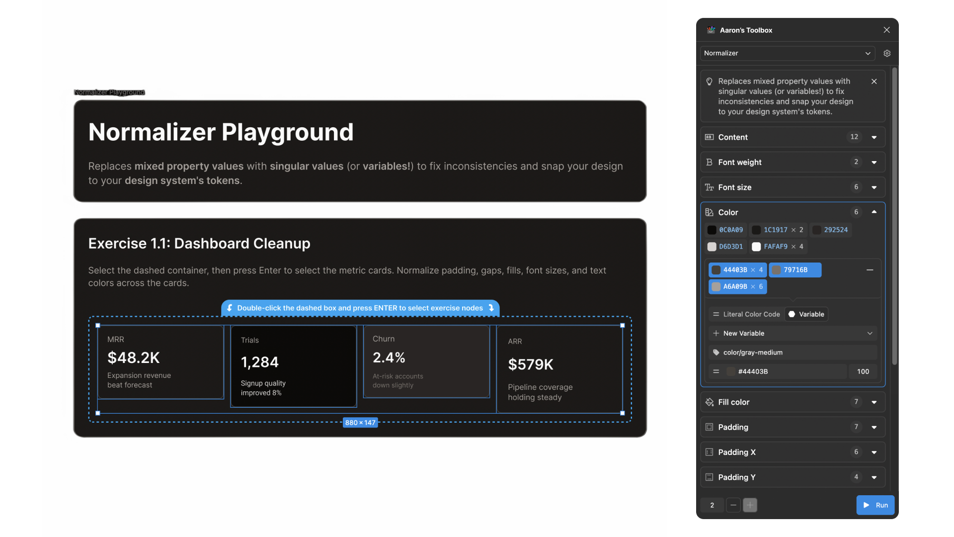
The Normalizer helps designers identify "stray tokens" in their selections and fix them all in one swoop. It highlights the differences between your selected nodes and allows you to coerce them towards your design system.

One example use case: a designer can select a frame with dozens of font sizes throughout and, in a few clicks, "redesign" with only a few, forcing each node to choose its closest allowed size. Instant, effortless conformity!

2 of 6: Normalizer

Make sample data feel believable

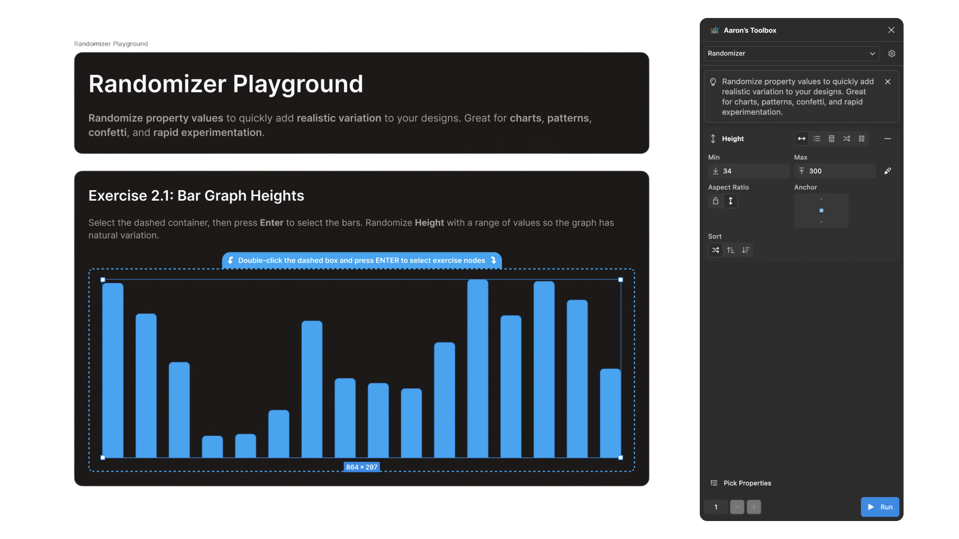
Property Randomizer began with a dashboard project. I wanted charts and data to look realistic enough that placeholder content would not distract from the design decisions being tested.

It began as an ugly form with min and max inputs for randomizing only the height property of selected nodes and quickly evolved into a whole lot more.

The latest Randomizer will write to just about any Figma node data type there is, including document variables, component properties, and individual colour channels.

3 of 6: Randomizer

Create components from disparate instances

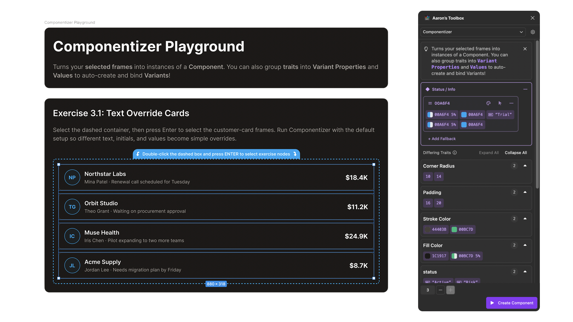
I realized that most of the components I make in Figma are created AFTER I've already hand-crafted (copy-pasted...) a few instances of the same thing. Starting with a component from the very beginning isn't always feasible, but this reverse flow meant not only creating the component itself but also configuring variants, overrides, and interactions.

The Componentizer works backwards from your already-built instances. It surfaces differences and lets you decide whether they're part of a variant or just a plain ol' override. Once you've assigned traits to their variants, one click creates the component, its variants, and any interactions you chose, and replaces your selected originals with instances of the new component. Bam! So much time and tedium saved.

4 of 6: Componentizer

Useful for work AND play

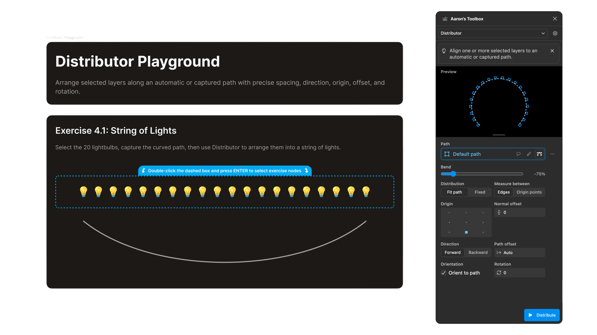
The Distributor is helpful for laying out large numbers of nodes, and it's also wildly amusing to just mess around with the power of instantly and perfectly placing oodles of objects on an arbitrary path.

5 of 6: Distributor

A missing feature became a shared tool

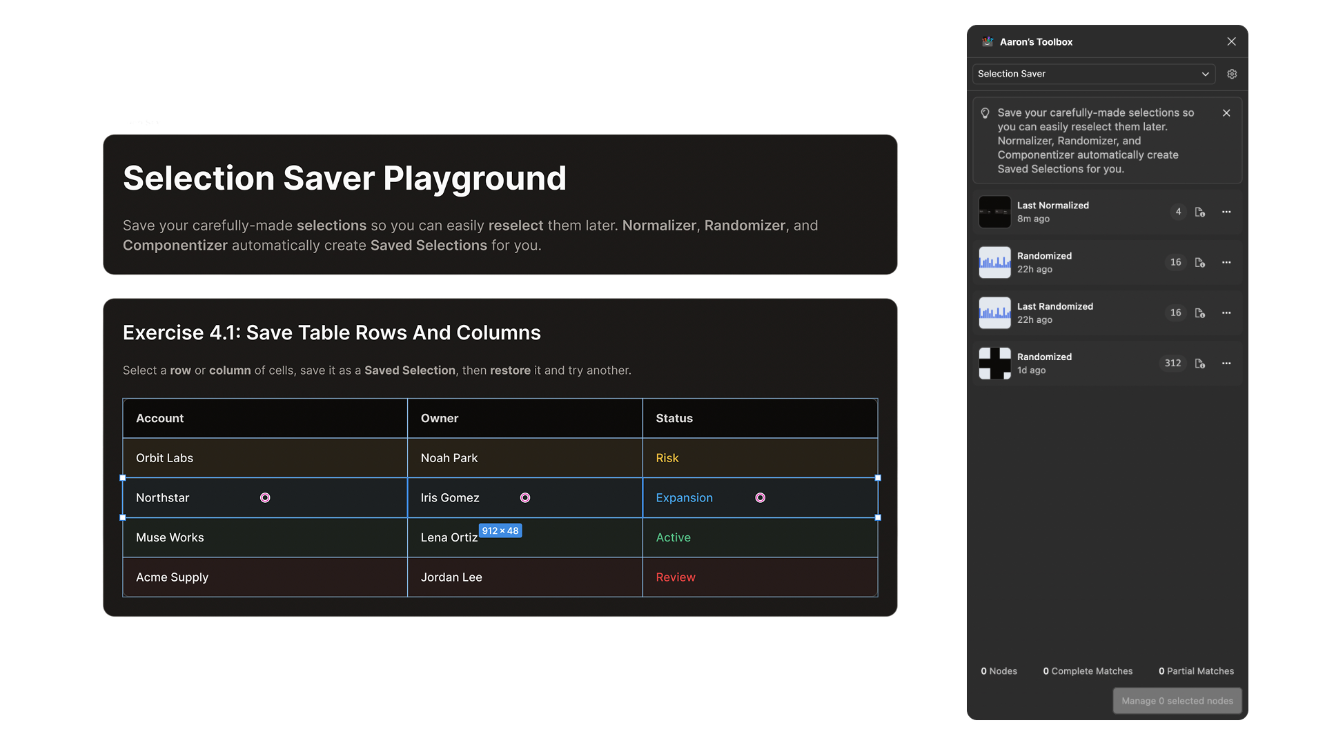
Selection Saver revived a feature I missed from Adobe Illustrator. It and Property Randomizer grew into tools used by tens of thousands of people in the Figma Community—the most satisfying proof that I don't suffer this tedium alone.

6 of 6: Selection Saver
Project
06
Company or product
Visit

Some of you may recognize the concept (it's Catch Phrase by Hasbro) but I've put my own twists on it, of course.

My original motivation for making the game was two-fold: first, I kept finding myself at parties with friends wanting to play Catch Phrase, but nobody had it. If only I had it on my phone... Secondly, I wanted to try my hand at React Native.

I've built this game at least five times now. I've built it with different themes, different mechanics, and on different technologies. Now it's just a simple PWA because it's the most accessible: just visit NextPhrase.app and add it to your home screen for the best experience.

I've learned a LOT building this game over and over, including the architectural challenges of building a game where pretty much everything is animated, despite running on a wee computer without 16GB of memory to lean on. Give it a shot at your next party!

Use , or 1,2, ... 0 to navigate sections

Portfolio media didn't finish loading.